-FINAL(01-00)-White&Blue-01.svg)
We talk a lot about digital marketing but did you know that we also design packaging? We occasionally geek out on Instagram about packaging designs we find in the real world and fall in love with (#designcrush). We’re always on the lookout for the latest innovations in design for packaging and we’ve found some really cool things we decided we couldn’t keep to ourselves.
We asked our design experts to share their favorite packaging designs on the blog and give a little background on what really stands out to them. Let’s take a look, shall we?
Daniel + Little Chef’s Barcode-less Designs
You may remember Daniel (aka Cool Dan) from a previous blog post. Well, he’s back and has some cool insight into a tech innovation in packaging from the brand The Little Chef:
In his own words:
When it comes to package designs, there have been large pushes to make the design work interactive and playful. Whether this is through cutting out shapes that play with graphics behind them, the use of bright patterns and colors that normally aren’t seen on packaging, or inventive package shapes to hold products, these styles are becoming the norm. Packaging (especially that of standard household items) is at the point of needing new innovation. The packages need something that sets them apart in a larger way than just an update on visual elements. This doesn’t mean that the graphics themselves are not important–they need to relate to the product and visually communicate what that brand embodies wholeheartedly while still separating itself from its competitors.
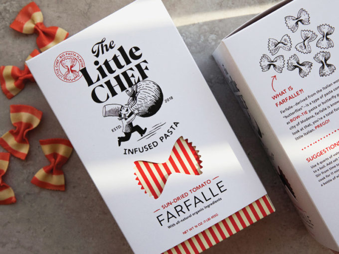
I’m a fan of the (soon to be released) The Little Chef Infused Pasta packaging. The packaging, done by Tad Carpenter, not only embodies that of a small mom and pop Italian cuisine vibe, but also elevates a common home goods.
Design-wise, the hand-drawn illustrations coupled with a simple color pallet lend themselves to the purity and innocence of a non-corporate, wholesome business. They create an honest feeling, while also being playful with the trend of removing a shape (bow-tie noodles) and incorporating an Italian-themed striped pattern.
The impressive technology side of this package that sets it off is its ability to be scanned anywhere. No more hideous barcodes and labels! Just simple, pure, unmodified design. This is not only more visually pleasing but also a large step in UX design. Consumers no longer have to waste precious seconds in this fast-paced day and age looking for the barcode –they simple scan anywhere on the box and they’re good to go. Ingenious.
Stephanie + Tarte Cosmetics’ Joie de Vivre
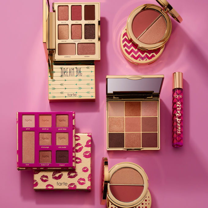
Stephanie is no stranger to package design or beauty (she is a fitness model on top of being an AMAZING designer!). Bringing her critical eye to the cosmetics industry, which is known for its emphasis on beauty, Tarte Cosmetics really stands out to her.
In her own words:
There are SO many reasons to love and admire Tarte’s packaging.
- Every product is a piece of art in and of itself. It invites consumers to celebrate, play, and most importantly, pick it up from a shelf and get a closer look.
- Each product pushes the boundaries of design by experimenting with patterns, gradients, laser-cut ornaments, fun shapes and uncommon materials like leather.
- Tarte really pushes against the status quote of the beauty industry, which tends to make packaging mostly black and minimalist (re: boring ), by creating fun shapes and bright colors while still keeping the brand sophisticated.
At the end of the day, a package needs to appeal to a consumer and invite them to pick it up, interact with it, and ultimately, put it in their cart. Tarte’s packaging checks all of these boxes and then some.
Holly + CS Lightbulbs
Holly is…Holly. She is goofy, loveable, and really passionate about design. Her personality comes through in all of the things she does so it’s not a surprise that her pick is truly unique!
In her own words:
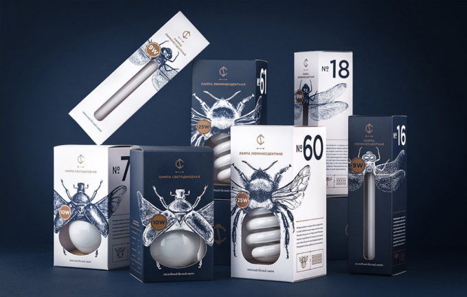
When doing my research I somehow stumbled upon this package design and was blown away! I’ve always had a thing for light bulb packaging for some weird reason, but I think this one takes the crown.
The thing that impressed me the most is this design’s ability to turn a standard box into something innovative and visually captivating. All the packaging has is a simple die cut that exposes part of the light bulb but then connects it to be part of the beautifully illustrative bug. I love how each different type of bulb has its own bug, it gives the bulb a distinguished personality and makes it come to life.
I’ve always enjoyed the use of illustrations on packaging, especially when the design can still be kept simple. The bug illustrations are pretty intricate but with the use of the simple color palette that features navy, gold, and white, and thoughtfully laid out type, the design does not become overwhelming.
Another thing that I think is pretty dope about these packages is that they produce each package in the same colors, allowing the boxes to be connected to create a bigger spread.
Other things to note that I think are pretty rad:
- I love the use of the big type/numbers to call out things
- The simple charts
- The product is part of the design
- The fact that a packaging design like this can make it in a not so design forward place
- Good use of whitespace
- Getting to see great design for items that aren’t considered “cool”
Package Design TL;DR
There are a few things that each of our illustrious designers picked out about their current design crushes:
- Use of color
- Use of shapes
- User experience with the packaging
- Making something ordinary extraordinary
The key to packaging that makes consumers (and designers) happy is creating something beautiful, personal, and useful.