-FINAL(01-00)-White&Blue-01.svg)
Several months ago, I was instantly attracted to these fun, new Snapea Crisps:
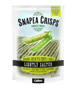
The package had beautiful fonts and textures with crisp, inviting colors! Captivated by the power of great packaging, I bought a bag. (They’re delicious.) After that one purchase, I started seeing them everywhere: bright, shining beacons of beauty on the shelves. As it turns out, they’re not new at all. Snapea Crisps have been around for several years, and yet I’d never been compelled to buy them. I’d never even seen them before. It might have something to do with this:
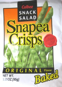
The old packaging is pretty bland, generic, with unattractive color combos, bad gradients, and off-putting outlined text. The snack just doesn’t look that appetizing. A simple refresh to the packaging transforms the product into something that looks modern, appealing and healthy! They gained a new customer by recognizing the need for a design refresh. So, how do you know if you’re in need of a packaging facelift? Here are a few tips to help get you noticed:
Are you attracting the right crowd?
Take the time to think about your target audience. Imagine how different the package needs to be to appeal to 5-year-olds (or their parents) as opposed to 50-year-olds. Consider if your product is directed primarily towards men or women, wealthy or middle-class. Attract the audience you want with the package.
Perception of value
If you spend a little extra on the package design (custom form factor, wood instead of plastic, unique print techniques), the perception of value increases dramatically. You give the impression of a quality product–something consumers can buy with confidence. They may even be comfortable spending a little more than usual.
Are you sending the right message?
While perception of value is important, don’t get so fancy that you confuse your message. A truly high-quality, gourmet product should be packaged differently than something that’s trying to appeal to consumers as the everyday, economical option. Determine what you want your brand to say and make sure that the packaging is reflecting that message.
Do you look credible?
This one really gets me. If you’re hoping that consumers will buy your product, your packaging shouldn’t look shady. This before and after from The Dieline is a fantastic example. The “before” packaging looks overly generic and questionable:
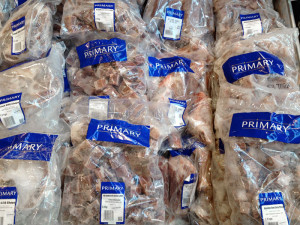
On the shelves all you see are frozen chunks of unidentified meat nuggets. Do you feel safe putting this in your body?
The revived packaging is vibrant and informative! The cool blue and the unique fonts are inviting and appealing:
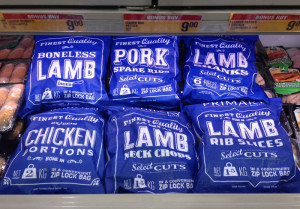
It’s easier to determine which meat product you’re buying–lamb, chicken, pork–and the whole collection stands out against its competitors. There’s an instant confidence in this brand.
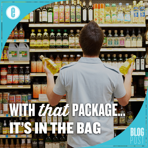
Whether you realize it or not, you’re attracted to a nice package. It really DOES matter. When there are aisles of endless options of the same product, it’s important to stand apart. If you think you need a little help making this happen, we’re here for you.