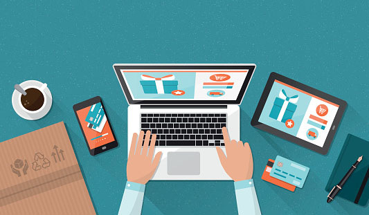
A customer doesn’t always know a great experience until they have one.
B2B E-commerce Expectations are Changing
B2B E-commerce buyers are more frequently preferring – and expecting – their experience to closely align with the B2C one. A great online experience is a game-changer for your brand, and with this in mind, it’s highly likely that your business needs to improve its online experience for your customers.
In this two-part series, we are going to go in-depth on visual design and content, two crucial elements in a successful e-commerce web design, even for a B2B business.
Visual Design for B2B E-Commerce
The first thing everyone sees is your web page itself, obviously. Ask yourself:
- Is it simple?
- Is the layout clear?
- Is it responsive?
- Does it offer breadcrumb trails (if appropriate for your industry) and tell your visitors where they are on your site at all times?
- Will users easily ascertain where to go next on your website?
If you’ve assessed the visual impression, and it possesses none of these things, there’s a lot of room for improvement in your brand’s online presence. Request a website facelift from your current web designer. You may even have to find a new one if they aren’t familiar or comfortable with responsive design. After all, smart designers take advantage of these new user behaviors and design the B2B website to leverage strong visuals to quickly communicate ideas and messages.
Those who visit your B2B E-commerce site should find what they are looking for quickly and easily, and purchasing should be just as quick and easy. Duh, right? Except you might have the opinion that your website is achieving this…and it’s not. Ask objective people in your life to navigate your website and attempt to purchase something. Then take their feedback seriously and make the appropriate changes.
A Few Other E-commerce Design Elements to Consider
Flat Design: This is the phrase du jour all over ‘best practice for web design’ search results. This design introduces a modern, engaging look–and looks great on mobile.
Icons: Use these to visually and effectively communicate what your company does–a must for B2B.
Anchor Links: As Wix explains, Anchor links allow your site visitors to find useful information quickly, without having to scroll up, down or move to another page. A single click on an anchor link will take them exactly where they want to go: back to top, down to the bottom or straight to your FAQ page.
White Space: Want to increase content legibility, impress visitors, allow for easy separation between unrelated design elements, and create a tidy, organized appearance? Segue Technology sings its praises as a way to create harmony, balance, and help to brand a design.
Responsive Design: Websites, even B2B E-commerce ones, are viewed way more often on phones and tablets than not, so the ability for visitors to scroll on your website is an absolute must–no ifs, ands or buts about it. You can negatively impact SEO if you don’t utilize this feature.
Long Pages: Driven by smartphones, and users who scroll with their pointer finger, long pages are now a web design staple.
-FINAL(01-00)-White&Blue-01.svg)


