Redesigning a website can be a daunting task, as technology is changing our lives on a daily basis. In my lifetime (and I still consider myself young), I’ve seen the transition from no one having a computer in their home to everyone having a computer in their pocket…and 2 or 3 possibly networked in their homes, not including their televisions and other smart devices that could be considered computers or computing devices. I mean heck, new legislation is being passed to accommodate self-driving cars. Well, I do have to admit that I thought cars would fly by now but I see the added levels of complication in that.
My point is – It’s difficult to keep up with all of the technological trends of the world, much less trends of the web. Since it’s probably not your job to keep track of such things, we thought we would give you a little snapshot so that you can see where you’re missing out, and what you might want to work in to your next website redesign or update. Notice, there is no mention of flash in this post, nor should there be.
Video Background Design
Video has become an integral part of every organization’s communication strategy… or should be. We typically recommend setting up a YouTube channel and embedding strategic and planned videos throughout your site. This will help with your search engine ranking and will provide an additional source of interaction and engagement with your customers and prospects.
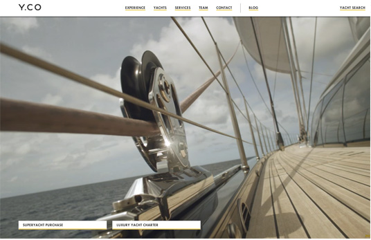
Embedding video on your site, however, is entirely not at all what I’m referring to as a latest trend. What I’m talking about is way cooler. A lot of companies have created beautiful and incredibly engaging home pages that use video as their foundation. In most cases, an immediate perception of value is created and the visitor is instantly pulled in to the brand. There are a couple of things to consider before implementing something like this on your site.
- The video MUST be extremely high quality production
- The video MUST be optimized for the web – to have a decent load time
- The video MUST be strategically planned to embody your brand experience
- You MUST have an alternate plan for mobile – this is easily done, it just needs to be part of the plan
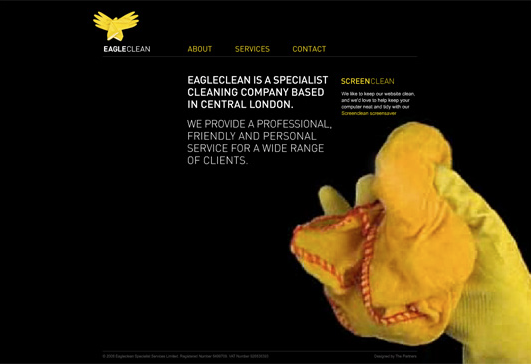
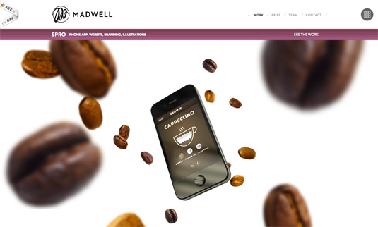
Here are a few great examples of websites that have effectively implemented video.
Blog Style Website Design
We’ve all been told how beneficial blogging can be for SEO and retention of prospects and clients. Some organizations have taken the concept a bit further and organized all their content in a blog format. This has been going on for quite some time, especially with individuals and companies utilizing WordPress themes but we have seen a surge in style as more and more organizations realize the power of engaging content and not just brochure style websites.
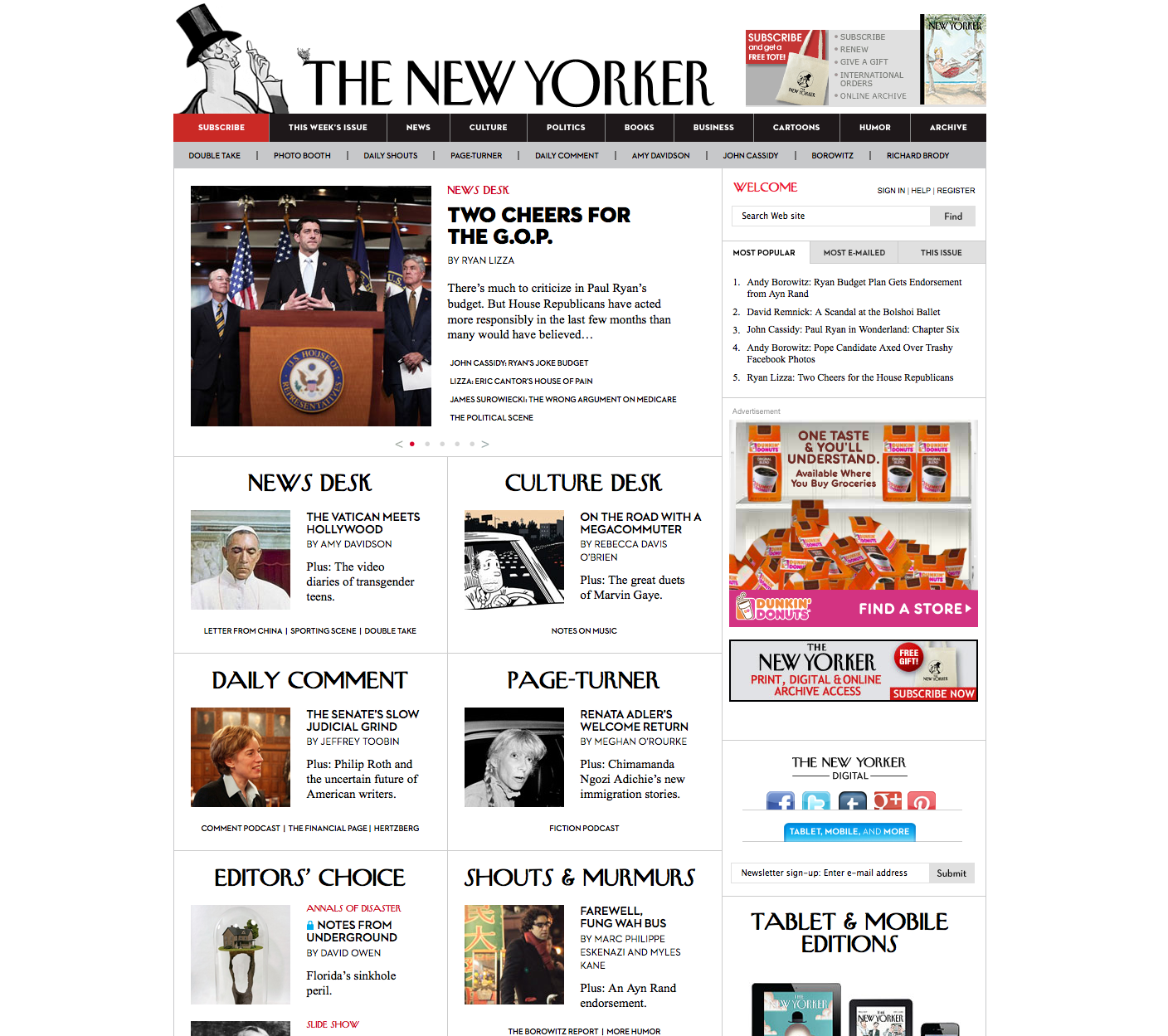
The New Yorker is a fantastic example of a news based site that organizes their content in a clean and efficient blog feed format.
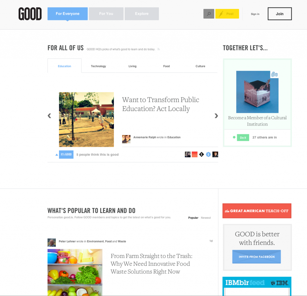
The site below is an incredibly designed social community called Good. It’s a fantastic concept and a brilliant blog design.
Responsive (RWD) Web Design
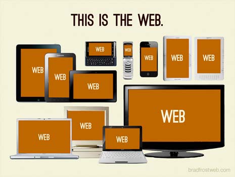
Responsive design is the developers’ answer to the bajillian (it’s spelled right, look it up) different viewing devices out there and the need for websites to be seen optimally on each. For most organizations it is not financially feasible to create a custom mobile application or mobile version of their site… and even if your company did invest in a mobile site, it may only be optimized for a particular screen width, making it an expensive and limited option. Designers and developers are now working together to create responsive sites. These sites will detect the screen width of the device and serve up the optimal site variation. In an effort to provide an extremely simplified explanation of how this can work… here’s a photo.
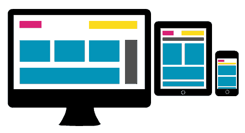
Notice that the image above shows three different versions of the same design, with content elements re-organized for the maximum viewing experience of those devices. Also, notice from the image below that as previously stated, there are a kajilliam (yep) different viewing devices out there and some of them change the viewing experience with the orientation of the device. It’s up to you whether you’d like to invest in trying to create an optimized version for every possibility, but as the world currently exists, two to four variations should suffice.
Parallax Scrolling Websites
If done right, parallax scrolling is an extremely cool element on a site for creating a greater sense of depth. Much like video, however, an alternate version must be created for mobile devices.
According to Wikipedia, Parallax scrolling is a special scrolling technique in computer graphics, wherein background images move by the camera slower than foreground images, creating an illusion of depth in a 2D video game and adding to the immersion. The technique grew out of the multiplane camera technique used in traditional animation since the 1940s, and was popularized in the 1982 arcade game Moon Patrol.
See how new this is? Even Wikipedia hasn’t seen that this is a hot new trend that has jumped out of the video game industry and onto people’s websites… go check it out! This is a very well done example:
Click here to view a recent post from Creative Bloq that highlights a few more sites using parallax scrolling.
Fixed Headers & Long Scrolling Websites
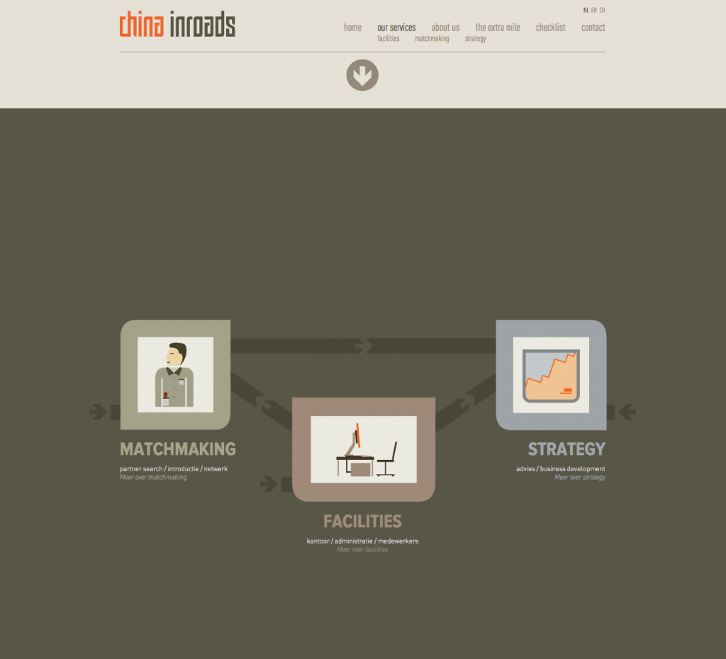
For many years, and even lately, business owners and marketing executives would request their site to be designed so that is “doesn’t scroll”. The idea was that you don’t want to have too much content on one page because you would lose the interest of your audience, or the audience would just simply not see the important information. Advances in JavaScript technology and new philosophies about website design have turned that concept on it’s head.
Fixed headers allow the main menu and any other relevant content or action elements to remain on the page while the user scrolls from page to page. See it in action.
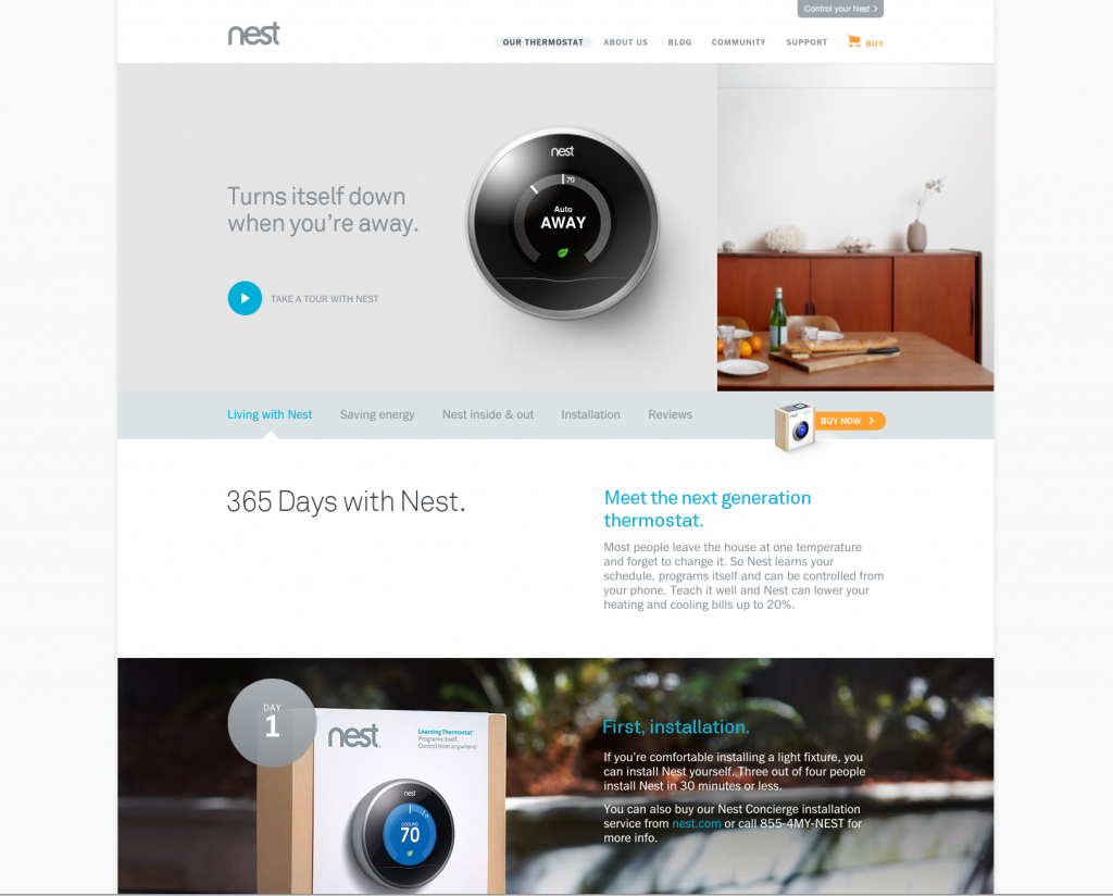
Also, if designed correctly, a long page of content can be incredibly engaging. Nest.com site has taken the place of the Apple website as the most commonly used example of sites our clients like.
Websites with Large Background Images
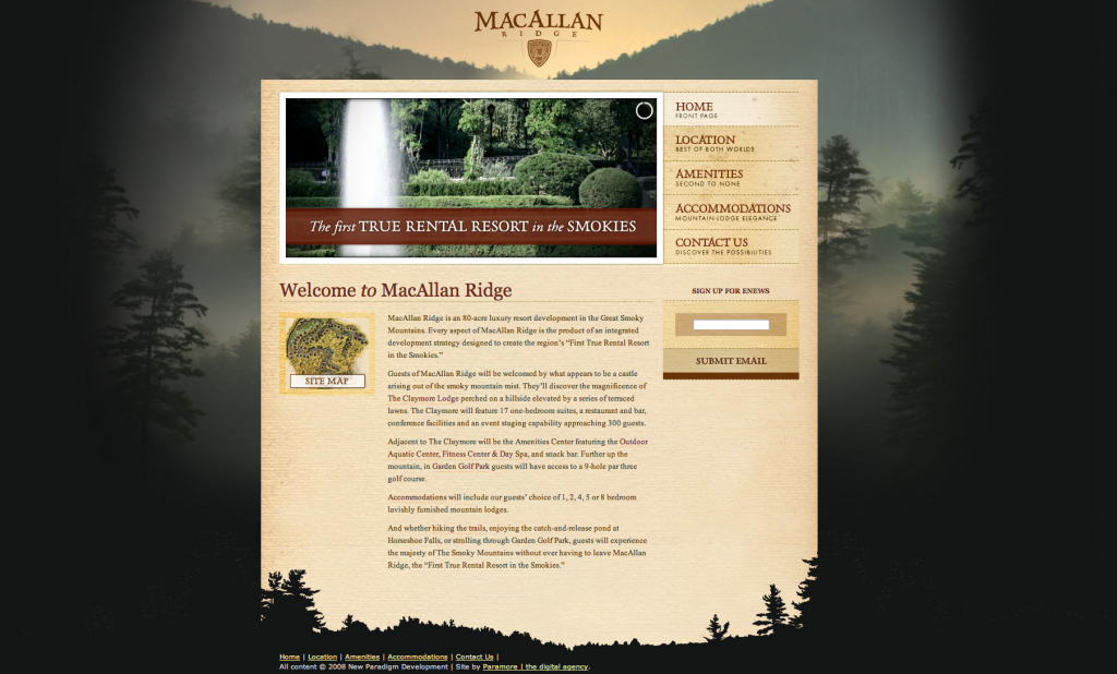
This design choice has been working its way onto the scene for a while but is just now finding its place in the main stream of popularity. Much like having a video as the backdrop for your site, utilizing a single large image is a quick way to present a strong statement and pull in the attention of your users. It can be done in a very traditional way like this Resort website, or in an in-your-face modern fashion such as the Dojo site below. If utilizing a setup similar to the Dojo site, be cognizant of providing enough content for your new visitors to know what you do. Cool only gets you so far.

Engagement and Marketing Automation In Your Website
Wow, that is a lot to cover in one post, but it’s pretty awesome stuff and just the tip of the ever-changing iceberg. I’d be remiss, however, if I didn’t add User Engagement and marketing automation to this list of website trends that are working well. Everything I mentioned above is an element of design and development that will help to establish and solidify your brand experience. Once you get their attention, however, you need to keep it. That is where multiple areas for engagement as well as strategic marketing automation can keep their attention and turn those browsers into clients. I’ll talk more about these elements in future posts.
Are you considering a web design or redesign?
The effort poses many questions: What will make my site better and more effective? What do I absolutely need to take into account for my end users? Are there serious SEO issues or new search engine rules that I should watch out for? The following free eBook answers the most crtical questions related to a successful web redesign project:
- Key elements and features “must-haves” for your homepage.
- Critical steps to protect your SEO and content during a site redesign.
- Steps you can take to improve your site right now while the redesign project is underway.
What trends do you see in marketing, and what are your thoughts about their effects on business?
-FINAL(01-00)-White&Blue-01.svg)
