“Wine is bottled poetry” – Robert Louis Stevenson

Maybe you’re in a fancy restaurant (it’s nice to treat yourself now and then). Maybe there’s a lull in the conversation and you start eavesdropping (no judgement). You hear the following: “…full-bodied, dark, and handsome,” and then, “vivacious, bubbly, and…effervescent?” Those aren’t people they’re describing, it’s wine.
Though it can be taken seriously or lightly, the uncorked truth is that every bottle of wine is different, even from the same producer and year. Wine is exciting for the way it transforms meals and moods. Indeed, oenophiles like to describe wine as being alive: opening the bottle today produces a different experience than opening the same bottle tomorrow. Choosing wine, even for the most knowledgeable also involves serendipity.
Even more than food package design, wine choice is guided by the emotions (let’s call price an emotion too). With a variety of customer knowledge levels, the wine world takes many different approaches to attracting the attention of its customers. For those who summer in Dijon, swirling and sniffing with the big boys, wine choice will come down to prior knowledge and current interest. Prior knowledge means: what have I tried and liked or disliked, and what do I know about the characteristics of this wine-growing region, varietal (grape type), or vintage (harvest year). Current interest comes down to the magic of pairing: what is the occasion and what will I be having this with. When pairing wine with in-laws we generally suggest an alcohol content level of at least 14%. But we digress.

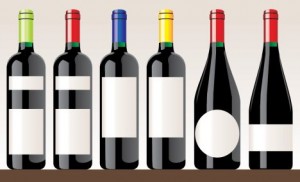
Before handling the emotional and crafty aspects of the label, the designer must take into account the information essentials that must legally appear on the bottle. There are five basic levels of information that will appear on a bottle:
1) Grape Variety (Appellation for many European regions)
2) Region where the wine was grown
3) The name of the producer or vineyard
4) The alcohol content % (usually regulated by law for a region and grape)
5) The Vintage (year harvested; not always included on cheaper bottles)
Information will usually appear on the front with more details and perhaps some pairing options or vineyard history on the back. Some wineries choose to use the neck of the bottle as well. More details, like personal notes about the founders or tasting/pairing notes can go a long way towards gaining the trust of a skeptical consumer. Wine is lyrical and the label should be too. For more information on the legal requirement of wine labeling, refer here.

Though many wineries use Old World grapes in wines that mimic the best of France and Italy, legally no wine produced outside Champagne can have Champagne appear on the bottle. Same goes for Chianti, Porto, Brunello di Montelcino, Burgundy, etc. Though New Jersey wine might not evoke rolling hills, endlessly joyous Sunday feasts, and country estate the way a Chianti Classico from Tuscany does, no fear! In the New World countries like the US, Australia, and Argentina, the trend is to label the wine with the appellation (where it was grown) and varietal (grape type). By eliminating jargon, the purchase decision becomes a little easier.
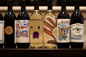
Even so, designers have tremendous power over the indecisive customer. Though mascots and furry creatures tend to adorn wines with less subtlety, including a cat or koala on a bottle might be appropriate when the brand calls for less fussy faire. As with food package design, the brand is king. Just as winemakers should only bottle wine that lives up to their standards of quality, the label must reflect the company’s values. Before sitting down with a designer, it’s helpful for the Wine company to summarize their three main values or objectives in producing the wine. This way, the imagery and font can work together to reflect and enhance the brand of the winery.

Until recently, wine labels tended to evoke prestige and established tradition. This made sense because the wines available for public consumption in Europe were produced on fancy castled estates from families with long-standing vested interests in the wine. Today some companies that still emphasize tradition, prestige, and elegance choose to use faded labels with family crests. This is meant to speak to the high quality of the wine, and in some cases, justify the price.
Wine isn’t all about reputation or about being serious either though. While more old-fashioned-minded wineries will keep the crest and go the way of effusive script fonts, many wineries have bold approaches to both wine and design. With something as finicky as producing transcendent juices from grape juice, why not be brazen with your design? Here are some interesting examples:
50 of the Best Wine Bottle Designs
-FINAL(01-00)-White&Blue-01.svg)


