-FINAL(01-00)-White&Blue-01.svg)
We spend a lot of time exploring marketing best practices, and if there’s one practice that is of utmost importance, it’s that good designs matter! Good design makes your brand memorable, enhances your authenticity, as well as your professionalism, and it effectively communicates your company values.
Our designers have been busy bees in 2019! We asked them to share some of their favorite design projects they’ve worked on and give a little background into why they loved tackling them.
Holly’s designs in her own words:
Austin Taco Project’s New Mural:
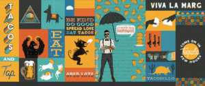
Creating a mural for Austin Taco Project was definitely one of my favorite projects I’ve worked on. This was my biggest project of the year thus far and it was so much fun to make. It’s always exciting to put a lot of hard work into something and then actually get to see it blown up to scale in person.
The entire project was extremely dynamic from creation to production and really gave me a chance to further my illustration skills. It’s fun to use various typography, colors, textures, and patterns. I’m looking forward to seeing how it will drive foot traffic into Austin Taco Project.
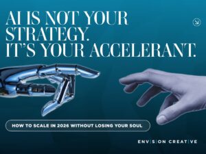
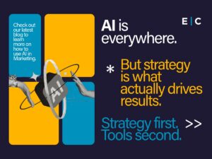
Envision Blog Headers:

I love designing headers for our blog because it allows me the creative freedom to try new styles and techniques. I’ve been working on making my designs versatile while still keeping a consistent theme so they look like they belong in the same series.
Doing work for the Envision brand is fun because I get the opportunity to show off my design talent and drive people to our site and blog. We post the blog headers on our social media platforms so it’s cool to be able to see which posts get better engagement. Because we publish a new blog each week, I get a lot of experience working on the headers which helps me improve my skills and learn different ways to use the tool within the programs just from pure experimentation.
Daniel’s designs in his own words:
Petros PACE Logo:
![]()
I really enjoyed designing the logo for Petros PACE because I love doing research before creating any design and this logo required quite a bit. I found out that Petros in Latin means stone or rock. Playing off of the Latin roots, I created an ancient laurel from two geometric P’s angled in. Ancient laurels represent power and authority, which seemed fitting for a financial institution.
The squareness of the mark represents grounding and strength, while the diamond angle creates visual interest because diagonals command attention. The colors were meant to resemble the slate color from the early era Porsche, which is still considered a symbol of wealth today.
Envision’s Social Media Cheat Sheet:
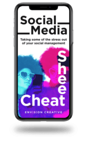
The social media cheat sheet was fun to work on because I was able to be abstract and artsy while still creating a legible and engaging piece of content. I love typography work and this project allowed my to utilize typography as the main design element. It’s fun to know the rules of typography and then figure out ways to strategically break them to create something interesting. I love working on projects for Envision because I get to have more creative freedom than I do on projects for our clients.
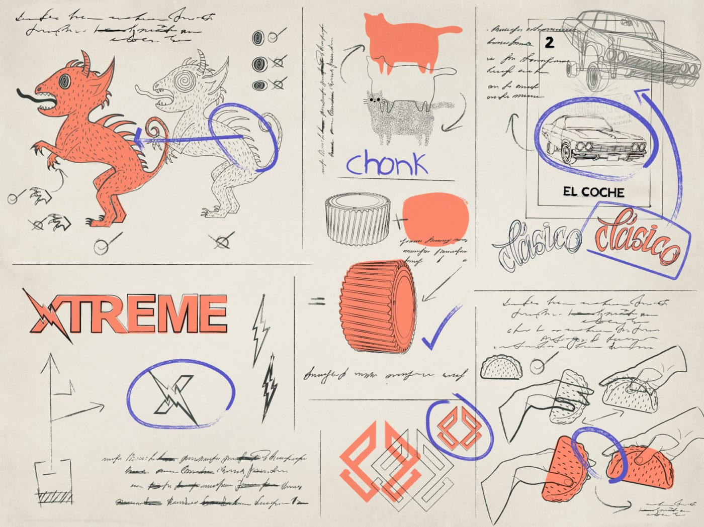
Serranos Loteria Card Designs:
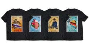
I love working on projects for Serranos because their branding is really fun and they always have exciting new ideas like this Loteria merch. This project gave me the opportunity to hand draw each illustration, create animation, and work with an amazing local print shop that I’ve been a fan of since college.
Xtreme Network Security Logo:
![]()
![]()
The Xtreme Network Security logo was also a project that required a lot of research. I wanted to find a way to harmonize several words into one comprehensive mark. I asked myself what mark can represent power, security systems, and cabling. I choose a bold type and used a lightning bolt to represent electricity which is a symbol of both literal and figurative power. I also choose a vivid deep yellow and dark aqua blue to give the company a lighter, more inviting feel, while the black assets represent the behind the scenes work they do (security cameras, cabling, and optics, etc.).
Favorite Designs TL;DR
As you can probably tell, our designers love taking on projects that allow them:
- To experiment with various types of typography, colors, patterns, and textures
- To do in-depth research that actively impacts the final design
- Creative freedom
Need help designing general branding, a new logo, product/food packaging, website, or anything else? Our designers are here to help!