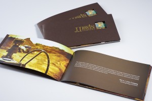
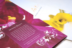
We take it as a given that people want any design that we come up with to be eye-catching, but with brochures that’s especially important. Why? Because there’s no room for middle ground – if it doesn’t immediately grab a person’s attention, give them a sense of what your product or service is all about, and invite them to continue reading, then it’s going to find its way into the recycling bin faster than you can say “missed sales opportunity.”
Simply put, there isn’t any middle ground with brochure design because the window of opportunity is generally so small. Brochures can be an extraordinarily powerful sales tool, warming up potential customers to the best benefits of your products and services before you’ve even met them, or keeping them nice and interested after your sales team has already given their presentation. For any of that to happen, however, it has to have a design that engages them and makes them want to learn more immediately. Otherwise, it’s just another piece of clutter that they can’t wait to clear away fast enough.
With that in mind, here are four things to remember about brochure design:
 Learn to love simple designs. The more white space there is on a page, the less of a hassle it seems like to read. You want your brochure to seem like it will take only a short time to read and digest, which favors simple, clean designs. One of the biggest and most common mistakes with brochure design is trying to cram too much in too small of a space, so be very aware of how much you are asking your design team to integrate into a small page or two.
Remember your real goal. The job of your brochure probably isn’t to actually sell anything, but to create interest in the potential customer’s mind. That might seem like a small distinction, but it can reduce the amount of information and graphics you need by half. Remember what your real goal is with producing the brochure, and tell people just enough of what they need to know to take the next step in the sales process.
Think of different formats. Brochures should always be print-friendly, of course, but they may need to be e-mailed from time to time as well. It’s also possible that your brochure could be turned into a web page. So, as you examine different designs and concepts, ask yourself: Will this layout look as good on paper as it does on a screen, or vice versa?
 Don’t forget about the text. Although design is almost always going to be the most important element of your brochure when it comes to catching attention, you have to have a message that compels people to take action, too. Otherwise, you’ve just got an interesting-looking document that isn’t going to help you meet your business goals whatsoever. The golden rule of brochure copywriting is this: Think less about what you want to say, and more about what you want your customers to know. That philosophy will almost always guide you to a more compelling finished version.
When it comes to brochure design, there really is no middle ground. Luckily, if you can follow these guidelines, you won’t need one because your brochure will be a powerful sales tool that customers will keep, read, and act upon.
-FINAL(01-00)-White&Blue-01.svg)


